

The best-case scenario in survey user-experience (UX) design is this: The experience is so seamless that participants input answers without thinking about it — it becomes almost second nature. The goal is to eliminate friction and make the survey so straightforward that the questions and the answers shine more than anything else. That’s how you get high-quality, authentic data.
As research practitioners, we have one shot at guiding participants through a survey in such a way that they’ll provide us with better answers, which is, ultimately, what we’re looking for. The reason we invest in building great user experiences in our surveys is so we can get the highest quality data possible for our clients.
Focus on mobile first
Not surprisingly, at DISQO, we’ve done a lot of research on survey UX. During the past 10–15 years, we’ve seen a dramatic shift in internet research — from most people taking surveys on a desktop computer, to most doing so on the go on a mobile device, whether that’s a tablet or a phone. This makes the investment in a great UX all the more important, because when someone's responding to a survey on their phone, chances are they’re more distracted than someone on a desktop computer.
Focusing on the user experience on mobile, specifically, means we want to keep the participant as focused on answering the questions as possible, with minimal friction in doing so. If a participant has to spend a lot of time thinking about how they are supposed to interact with the survey, itself, then we’ve failed in doing our job.
If you build it, they will stay
To build an experience for a mobile participant, you first need to understand what interactions are easy to display on a mobile device, and what interactions might be a little more challenging. For example, the classic grid research question involves a number of columns and rows all presented on one screen. That interaction becomes quite challenging for a mobile participant, because you’re asking them to scroll both vertically and horizontally. Horizontal scrolling on a mobile device is excruciating: You lose your place; you’re not sure where you are. So for that question type, we built an experience that’s progressive: We show one row at a time, and it scrolls dynamically. Each time you respond to one of the rows, it will scroll down to the next row. Eliminating horizontal scrolling is essential.
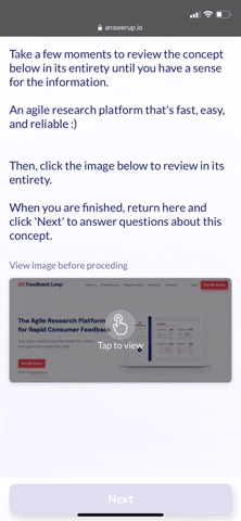
Another example: You have a survey where you want reactions to a concept, say a screenshot of the landing page of your website. Some surveys will ask you to open a new tab in your mobile browser in order to view that image, take a look at it, then return back to the survey. The more you ask someone, especially on mobile, to leave the survey to view or do something else, the more likely it is they will drop out and not come back to the survey at all. To combat that, any time we want to show a participant something, an image file, a .gif, or a video, we embed them directly in the survey, so they never have to leave the experience.
It’s surprising how many major research providers are still fielding surveys that just don’t display well, especially on mobile, which directly affects the quality of the research they’re conducting. Good UX drives users’ engagement with the survey. The more time we can keep a survey participant focused on the question and their answer, the less time they’re spending on trying to make a button work and advance to the next screen. When we take the friction out of the process, participants can stay completely focused on simply responding to questions and completing the survey. The happier they are with that experience, the more likely they are to provide more authentic, high-quality responses.
To find out how DISQO Experience Suite can help you connect more meaningfully with consumers early and often, contact us today.


